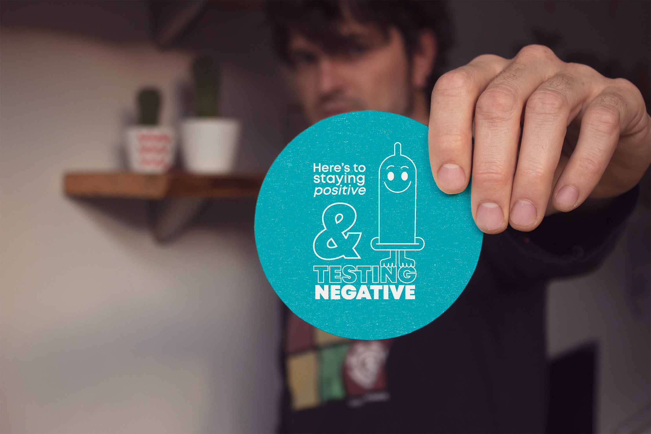
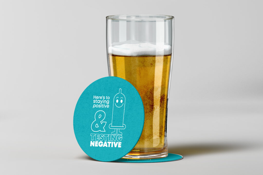
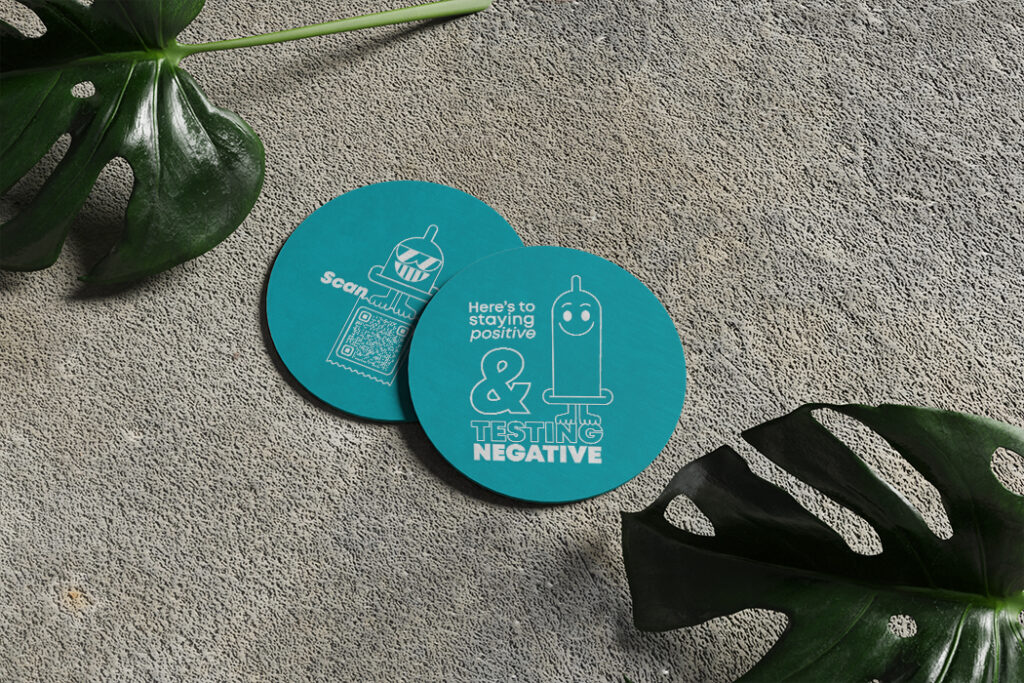
To revolutionize STI and HIV outreach within our health department, we've tapped into the vibrant pulse of bars with a new idea: STI/HIV prevention bar coasters.
Think of them as more than drink rests; they're dynamic messengers seamlessly integrating critical health information about preventable and treatable sexually transmitted diseases and infections into the social fabric.
With every drink placed on these coasters, the hope is that the only thing spreading in these spaces is awareness, reaching individuals who might otherwise remain beyond traditional outreach efforts. It's about creating an immersive experience that resonates deeply within the heart of social interaction by giving maybe a laugh but definitely accessibility to our services.
So, let the whisper of vital health knowledge accompany the clinking of glasses as these coasters stand as beacons of enlightenment in communal gathering spots. Here's to health, education, and a future free from preventable diseases!
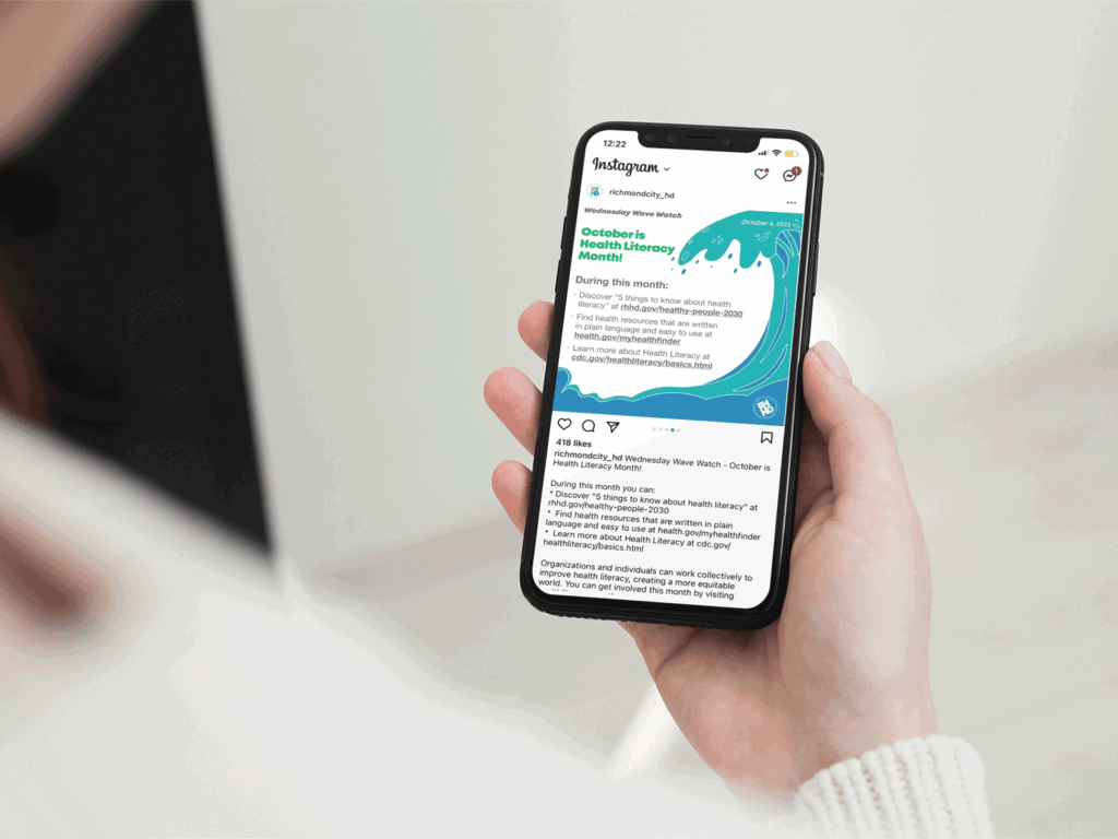
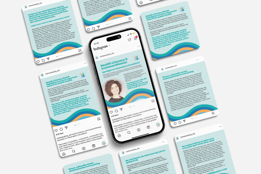
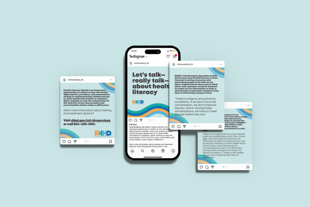
October is health literacy month, which I have been extremely excited about; I’m so passionate about health literacy and education around this topic. I’ll share more on that another time, but here are some fun social media posts about it.
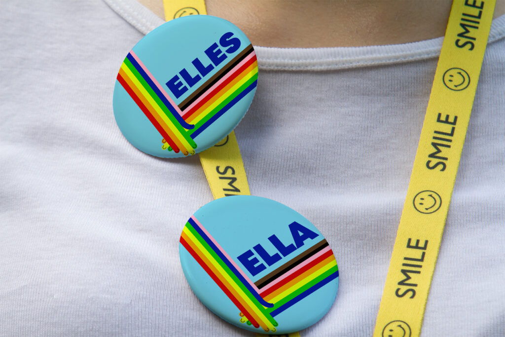
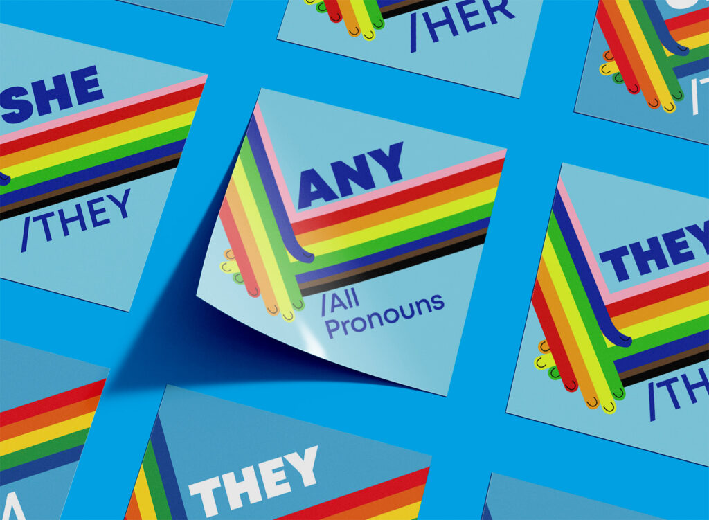
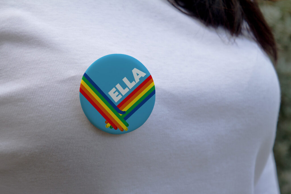
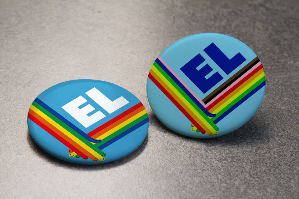
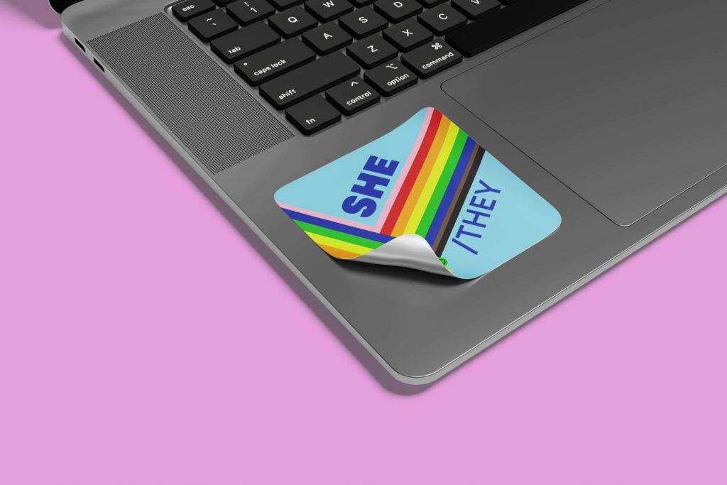
Also, you can view some fun pronoun stickers and pins for department events at the end!
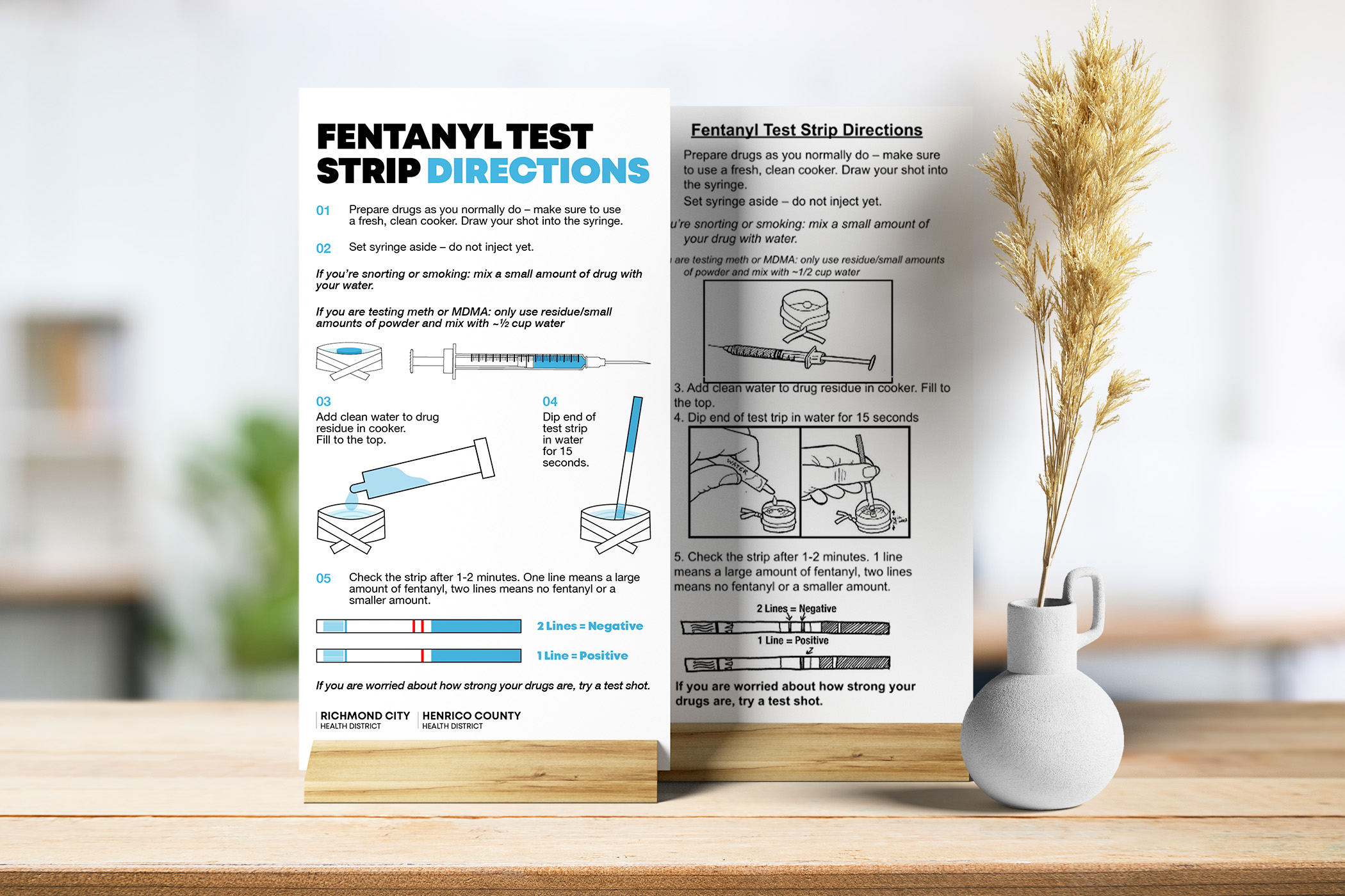
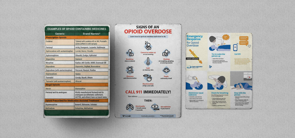
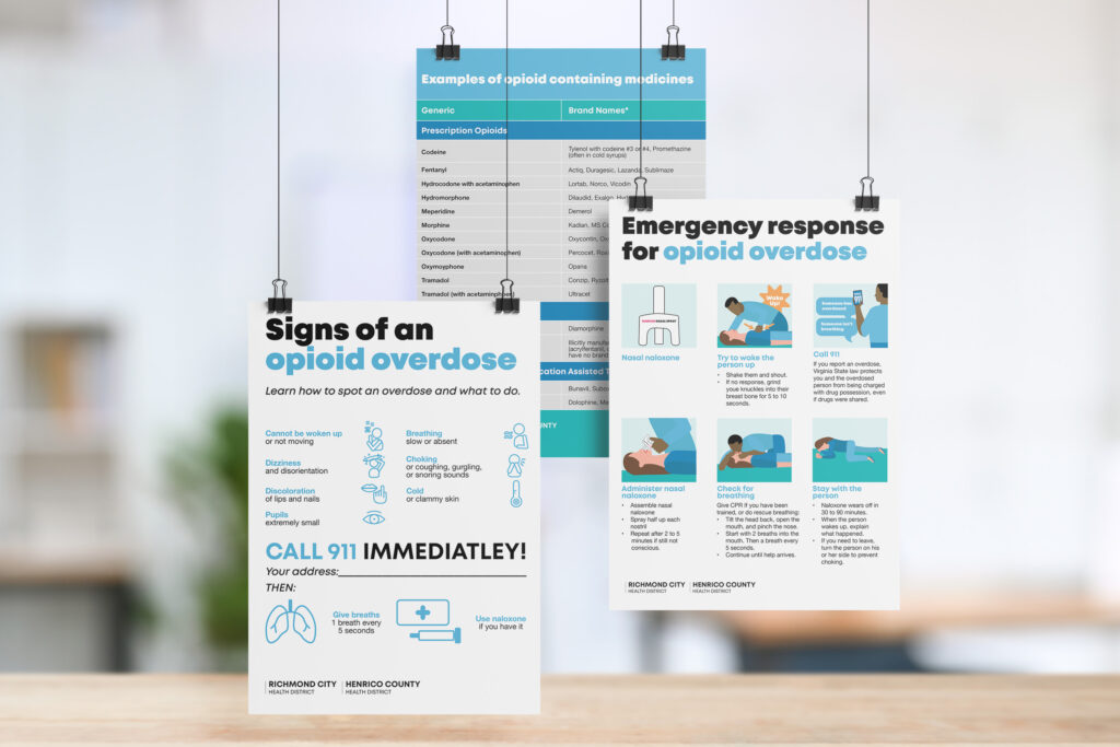
In the ongoing battle against the opioid crisis, education and prevention play pivotal roles. In collaboration with the Richmond City and Henrico County Health Districts, we identified the pressing need for updated resources to support the department's opioid prevention program. Recognizing the importance of visual communication in conveying complex messages, I used our old materials to create new ones. Here is a quick look at the old verses the new opioid prevention materials.
Fentanyl Test Strip Directions
The older version is on the right, and the refreshed version can be viewed on the left.
Steps to Recognize and Respond to an Opioid Overdose
The older version is on the left, and the refreshed version can be viewed on the right.
Health literacy is the ability for patients to comprehend complex health information and make informed decisions relating to their health. The study proposes visual aids to bridge the communication gap between health professionals and patients.
Explanation of seven different photo editing styles.
Each photo editing style evokes a unique emotion; simply lightening shadows creates a welcoming environment. In contrast, the same photo with darkened shadows heightens the photo’s dramatism and edge. Here are seven common photo editing styles that photographers use to create a photography experience you can feel!
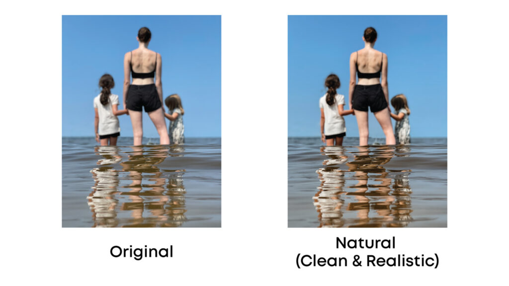
Natural (Clean & Realistic) - Are you wondering why a natural style even exists? Maybe you’re laughing to yourself right now thinking that photographers actually try to make a natural photo look natural – I get it, and I’m laughing too. Editing photos to look clean and natural as possible is very necessary for any picture. This editing style uses color correction, contrast enhancement, white balance adjustment, saturation and tonal correction, and sharpness and noise reduction to achieve a natural look. As a photographer, editing raw photos is still necessary, this fact is why: when you take a picture you have very little control of your environment. The control you do not have in the physical environment, you will have while editing. This editing style is the basic style used by editors and applies to every photo, regardless of settings or background. A natural looking photo is timeless and should be a go-to for beginner editors.
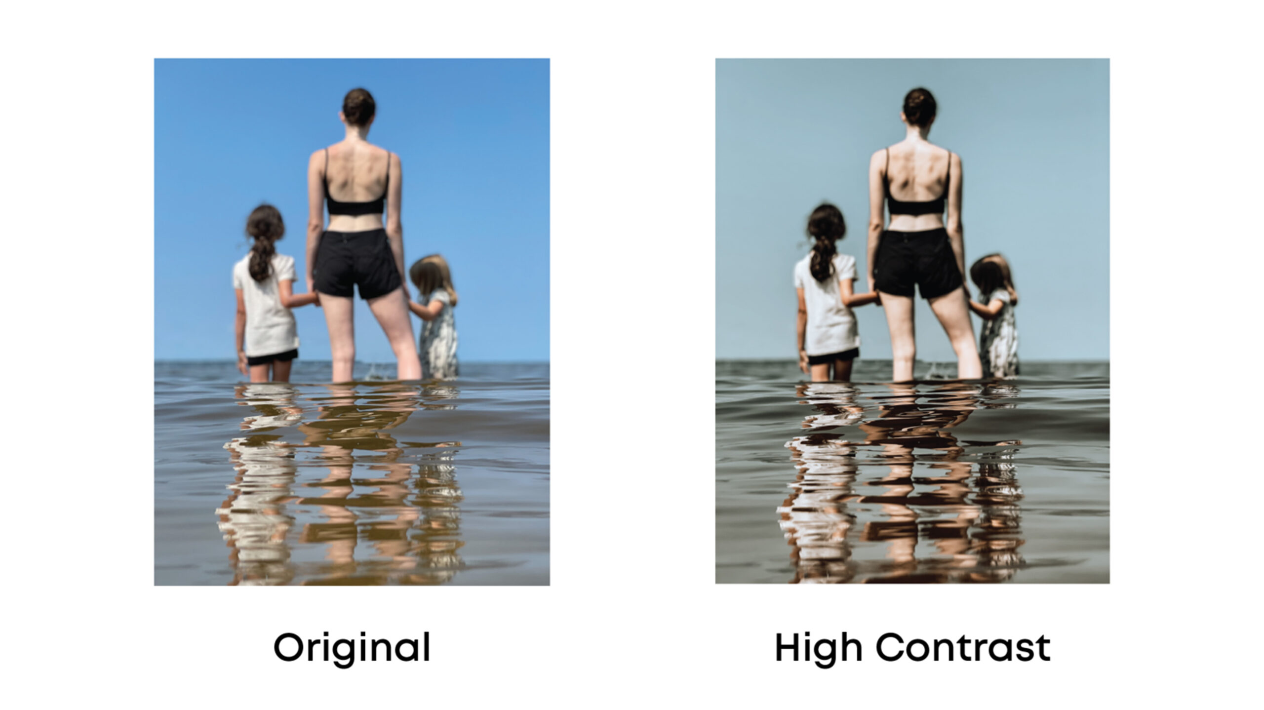
High Contrast - High contrast editing creates a dramatic and edgy appearance. High contrast is when there are two highly contrasted areas – Duh! Right? This editing style primarily concerns itself to the light and dark areas in the photo. Meaning, the light and dark areas in your photo will be more dramatic. High contrast uses preexisting shadows and darkness to create contrast against the color in the photo. This editing style creates clarity using shadows and tones and is great to use when there is a subject or element that you want to draw attention to in your photo.
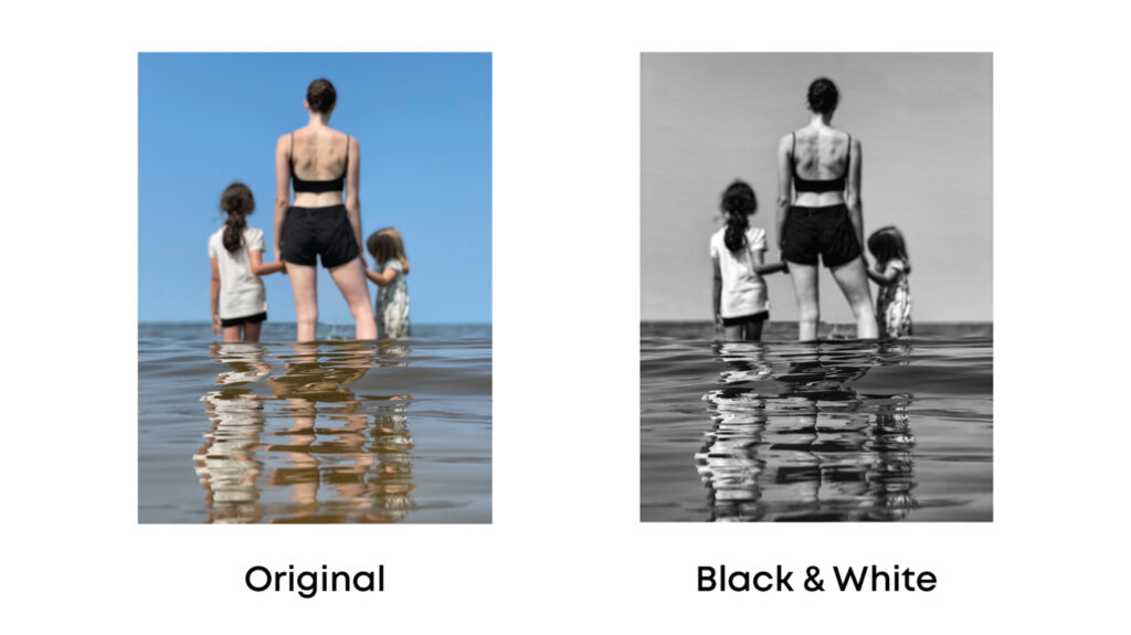
Black & White - When black and white photos are professionally edited, they should use mid-contrast. Using mid-contrast in black and white photo’s preserves details; by using a traditional black and white photo filter, you may lose detail. This look is easy to achieve, but you may need to adjust the sharpness, contrast, blacks and whites. Black and white photos remove the distraction of color and provide depth; allowing the viewer to focus on the main subjects of the photo. In addition, the warm black and white editing style can be used for casual portraits and landscapes, and is a brighter alternative to traditional black and white photos.
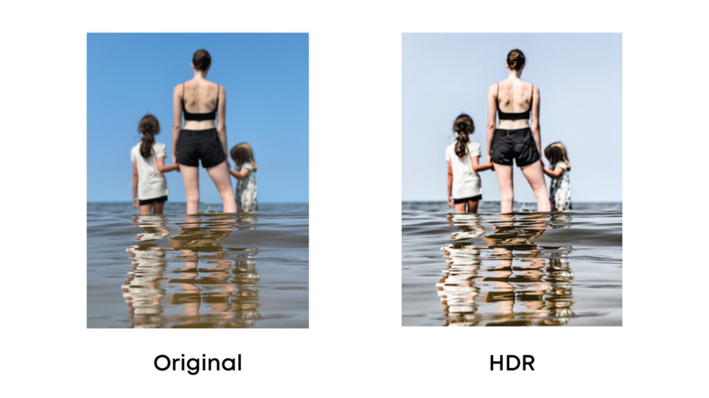
HDR (High Dynamic Range) - Have you ever seen a beautiful landscape or building and thought, the pictures just won’t do this place justice? HDR means High Dynamic Range, this photo editing style is AWESOME for landscapes and architectural photography. Dynamic range is the distance of intensity of the lightest tones to the darkest tones in your photo. The higher dynamic range your photo has the closer the photo will resemble how human eyes perceive a scene. Using HDR to enhance your photo magnifies details in the shadows and highlights that your camera may not capture. HDR = what your eyes see, not just what the camera captures.
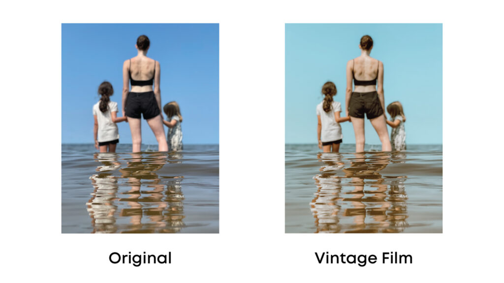
Vintage Film - Vintage film is an editing style that is quickly coming back into popularity! This editing style mimics the style of old film cameras when photos were originally developed in the darkroom. Vintage film is an editing style with a matte finish, less vibrant or saturated colors, and heavier grain. Vintage film is an aesthetic that photographers use to draw on feelings of nostalgia; this style is great for casual portraits, outdoor photos, and abandoned buildings.
Dark & Moody - Dark and moody editing darkens shadows and draws the viewer’s attention to the highlights in the photo. Usually, the subject or object in the photo will be highlighted, and the background shadow will be edited darker and heavier. This photo editing style is great for evoking emotion in the stillness of the photo.
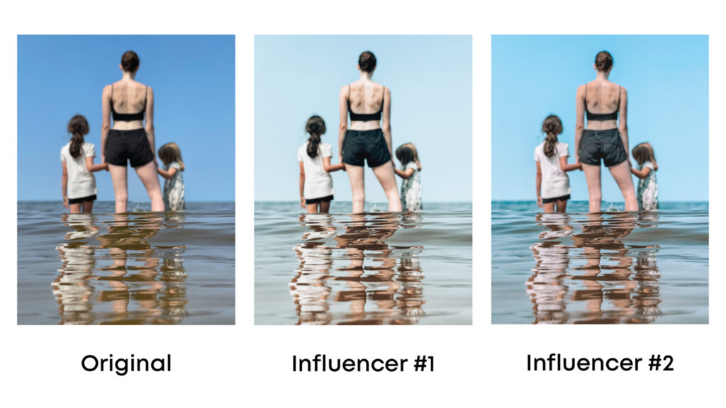
Influencer (Light & Airy) - This style of photo editing is very popular among social media influencers and social media users. The light and airy style used by most influencers impressively establishes a cohesive feed and brand. This style brightens white, improves highlights, and reduces contrast and shadows to achieve a cleaner, bright aesthetic.
Bonus Tip!
Before you edit your photos, know the file type you are editing. Did you take the photo on your phone or on a digital camera? Do you know what file type your device uses to store your image? The file type is important! Raw files, store more color data, have a uniform tone, and have more editing options. JPEG images have fewer editing options because the white balance automatically applied by the camera cannot be undone. Knowing your image file type will streamline the editing process.
Imagine an alternate reality where your clothes, routine, food, and all types of art are the same. I know, scary, right?
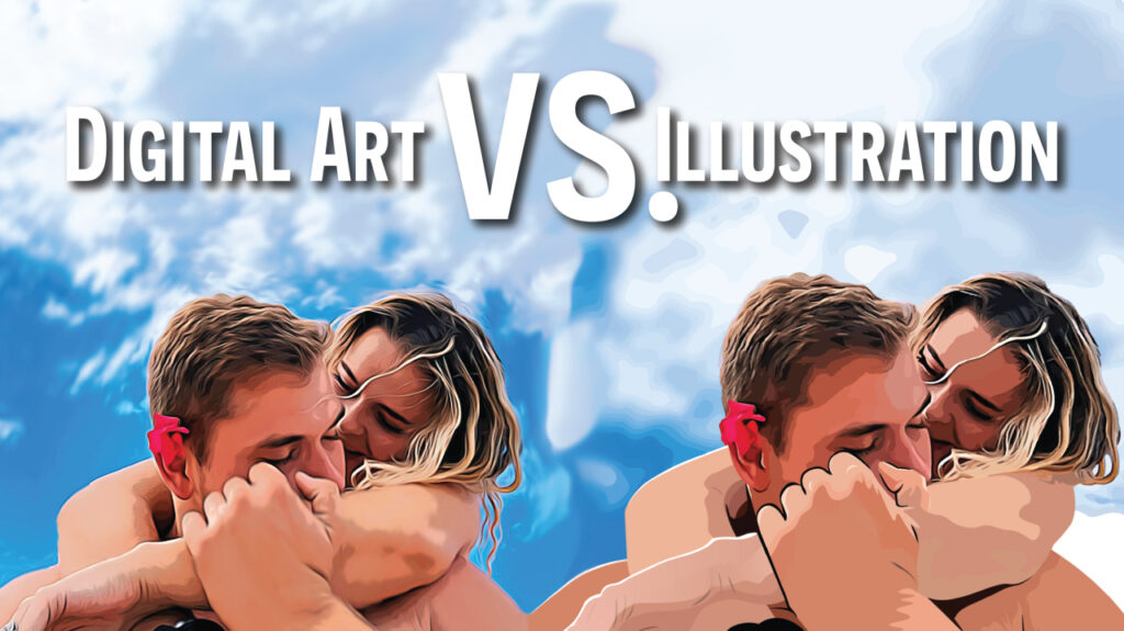
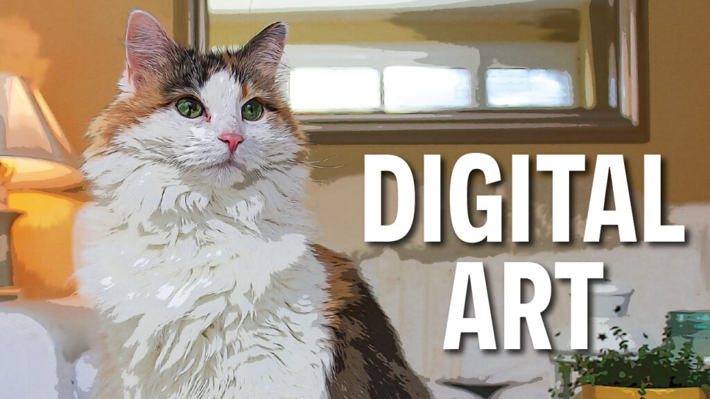
If you are reading this article, you may be wondering what differs between illustration and digital art. No matter what you believe about digital art and illustration, I won’t tell you what to think. Instead, provide you with relevant information to counsel your belief on both topics. I’m sure you like this article already; because your thoughts on the subject are not wrong yet.
Let’s get one thing straight before we embark on a very hard-to-explain endeavor. Illustrations explain fundamental concepts; digital art is the personal expression of the artist’s perception of ideas. The purpose of one is reality-based; the purpose of the other is individually based on one’s interpretation of the same reality. Factually, digital art and illustration are different. Perceptually, they can appear the same.
ILLUSTRATION IS...
Illustrations are visual explanations of text, ideas, processes, or concepts. Illustrations are painted, drawn, carved, or created using illustrative software on a computer. Yes, even a painting in your favorite art gallery or cute cat mug at home has a communicative purpose. Traditional illustrations are made with pencils, pens, markers, paint, etc. Illustrations are only a form of digital art when made with computer software.
What Traditional Illustration is NOT:
This section aims to discuss illustration in general, not the different categories of illustrations. However, I want to briefly consider a common type of illustration that is easily confused with digital art.
When you see an illustration paired with text in communication materials (magazines, flyers, posters, cards, etc.), these are graphic illustrations. Graphic illustrations are the joining of graphic design and illustration only. Graphic illustrations can be considered digital art, though their purpose is comparatively dissimilar to digital art.
DIGITAL ART IS...
Digital art is a piece of art built online; it really is that simple. The term “Digital art” was coined in the 1980s after the creation of digital painting software. Once again, digital art regained popularity in 2017, primarily among cryptocurrency investors who saw the value in owning digital art. No, I will not be discussing NFT’s today; that’s a headache for another day and another article.
Digital art can use a combination of photography, illustration, digital painting, and photo editing, all in one. Digital art requires proficiency in various design platforms that take years to achieve. Since the invention of free or affordable digital software, this artistic medium has been accessible to anyone with an internet connection.
Digital art allows artists to manipulate shadows, subjects, highlights, details, colors, and textures giving digital art a distinctive style.
Digital Art is NOT...
Digital art is not a type of illustration, although one could argue that it is. Yes, digital art can illustrate a concept or idea, and yes, it can be paired with text. Like I previously mentioned, illustrations and digital art do not serve the same purpose. Digital art’s goal is not to explain tangible ideas; rather, the artist's expression of individual beliefs translated into the digital art style they choose. Digital art is the artist’s perception and interpretation of their personal reality, not your reality.
ILLUSTRATION VS. DIGITAL ART EXAMPLES:
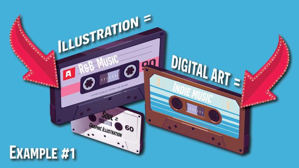
Example #1
Let’s pretend that “illustration” is the genre of music, “R&B.” Within the R&B genre, there are sub-genres; soul, funk, disco, pop R&B, etc. Graphic illustrations are a sub-genre of R&B, like soul, funk, or disco music. R&B music’s goal is to make you dance or sing along. Illustration and R&B both have a purpose of producing action. Now, we can pretend that digital art is the music genre, “Indie.” Indie singers tell you a story by interpreting an experience or event. Indie music does not inform you of a concept or spur you toward action. These genre and art comparisons are merely, for example, and your amusement.
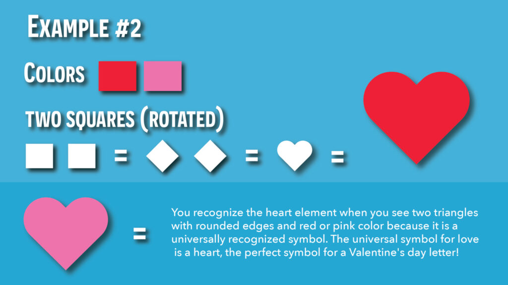
Example #2
A graphic designer's project is to illustrate a heart for a set of Valentine’s day cards. The graphic designer’s purpose is to illustrate a symbol that identifies with the concept of love. So, the designer illustrates a heart symbol in a recognizable style that people associate with love. The designer will use red or pink, merge two squares, rotate the squares to look like a diamond, and round the edges. Thus the recognizable heart shape is created.
You recognize the heart element when you see two triangles with rounded edges and red or pink color because it is a universally recognized symbol. Additionally, the universal symbol for love is a heart. Think about it! When you see a heart symbol on a letter in the mail, you know the graphic element is a heart, and you can ration that the letter will talk about love.
In contrast, digital artists will produce their interpretation of a heart. The artist’s interpretation of a heart may not be red or pink. Maybe the artist is exemplifying a sad broken heart. They may use darker somber colors. The design may appear more realistic than a simple flat illustration of a heart.
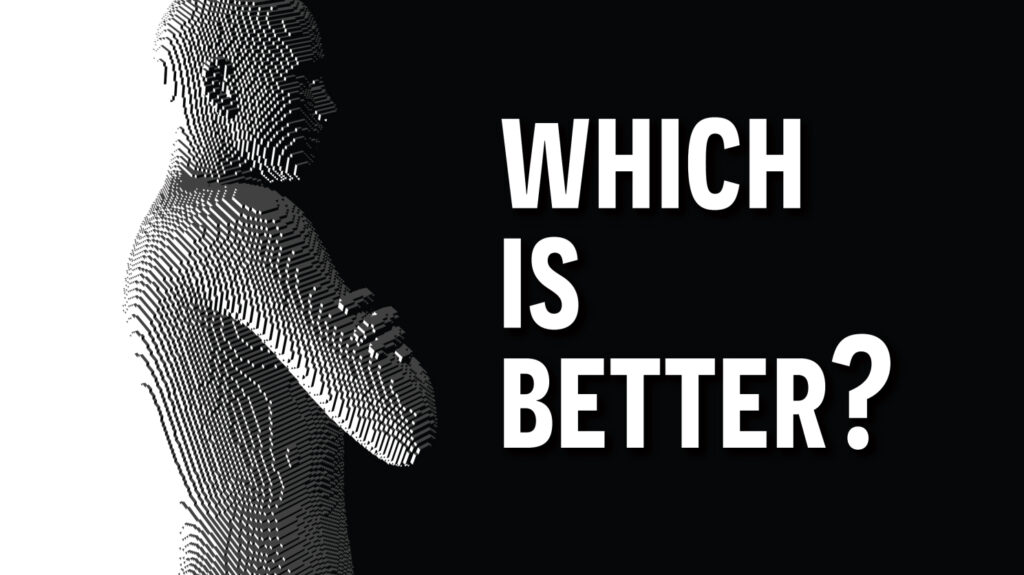
CONCLUSION: WHICH IS BETTER?
If you made it to the end of the article, it means that your opinion has been informed.
Illustrations practice semiotic theory; how signs and symbols communicate meaning. Illustrations convey universally comprehensible ideas. Digital art is the artist’s perception of ideas only.
Illustration and digital art are not the same concepts; your preference toward either is ultimately based on the interaction of the artistic mediums in your own life. If you work in the communications, marketing, or public relations industry, illustration is a superior tool. Suppose your professional industry is fine art, graphic design, or art direction. In that case, you might have a softer spot for digital art's emotional depth or vibrance.
I will leave you with one last thought. An illustration reflects a tangible idea or concept that encourages action. Illustrations explain. Digital art expresses itself and does not depend on textual explanation.
Digital art is an expression of the artist themselves; illustrations are made for everyone else.
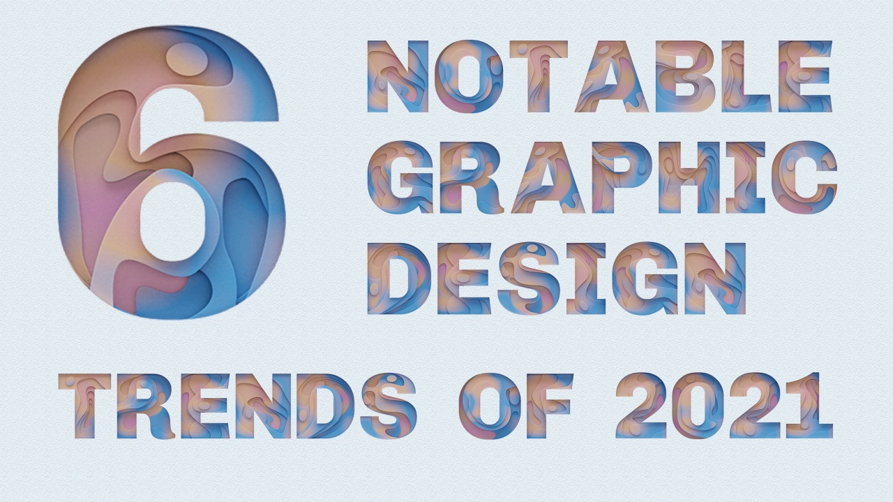
As this year comes to a close, it’s the perfect time to look at the notable graphic design trends of the year.
The year 2021 has been full of changes, especially after the 2020 roller coaster we all rode together. Most of the world has still been in a pandemic, dealing with the reality of a quickly-spreading virus. People have relied on social media and digital marketing more than ever, and specific trends have emerged from this reliance. As this year comes to a close, it’s the perfect time to look at the notable graphic design trends of the year.
HERE ARE 6 NOTABLE GRAPHIC DESIGN TRENDS OF 2021
Minimalism
First, a trend that has been around the last couple of years is minimalism, and it didn’t slow in 2021. Minimalism isn’t just for people who want to get rid of their belongings and live in a tiny house. People have discovered a joy of having less, and it has filtered into design. Additionally, simple, black-and-white designs have continually dominated apps and logos. Designers use intentional white space to allow their designs to breathe.
Maximalism
Yes, a design trend the exact opposite of minimalism exists. Think of an imaginary paint can with a mix of illustrations and visualize a blank canvas. Then, splatter that illustrative paint over your entire canvas. Maximalism is a personal favorite of mine, and this is why. Maximalism is fun, bold, intricate, and over the top. This design trend uses a combination of vibrant colors, textures, characters, shapes, and elements. Maximalism is true to its name and uses every design aspect to create a flavorsome party mix of your favorite designs.
Flat Design
Flat design is a design style that uses simple, two-dimensional elements and a broader range of colors. While it can seem to contradict minimalism at first, the simplicity of flat design gives depth and enhances the qualities people love about minimalism.
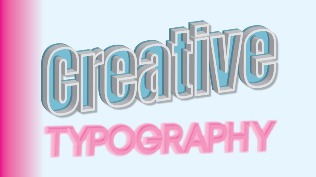
Creative Typography
We have also seen an increase in creative typography, especially 3D lettering. The 3D design trend can have a realistic effect that gives more significant movement to words. In addition to the 3D typography that is trending, hand-drawn typography has been widely used. Handwritten typography gives distinction among brands; they are a great addition to building a trustworthy and exciting brand identity for any business. The wrong serif font can make your design look outdated, but the right font can make your logo or design look elegant; Serif fonts have made their comeback. Serif fonts are timeless and nostalgic, and they can be incredibly eye-catching because they are rarely used.
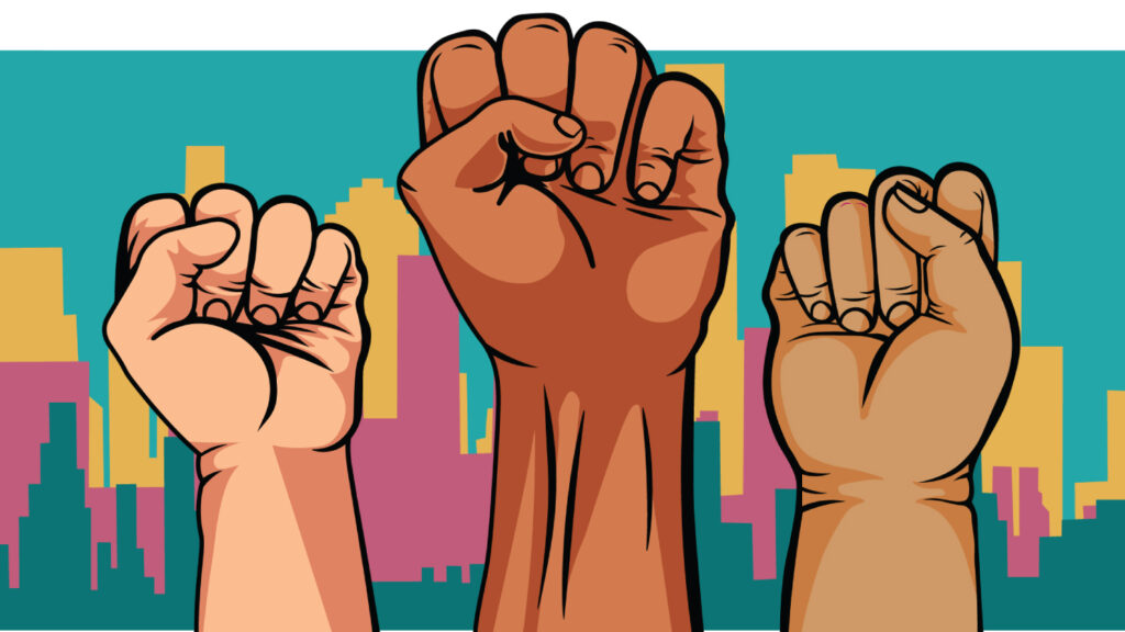
Inclusivity
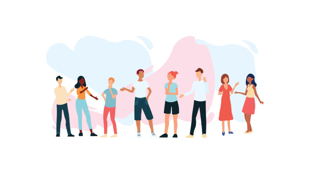
It’s no secret that the past two years have been monumental with change. One of the best graphic design trends to emerge this past year is inclusivity, finally! This year has shown a real focus on inclusivity from various skin tones, ethnic backgrounds, and body shapes. Brands and designers are listening to the world and joining the inclusivity movement. Industries alike are actively trying to diversify their workplaces, branding, and language more than ever, so that everyone can be represented.
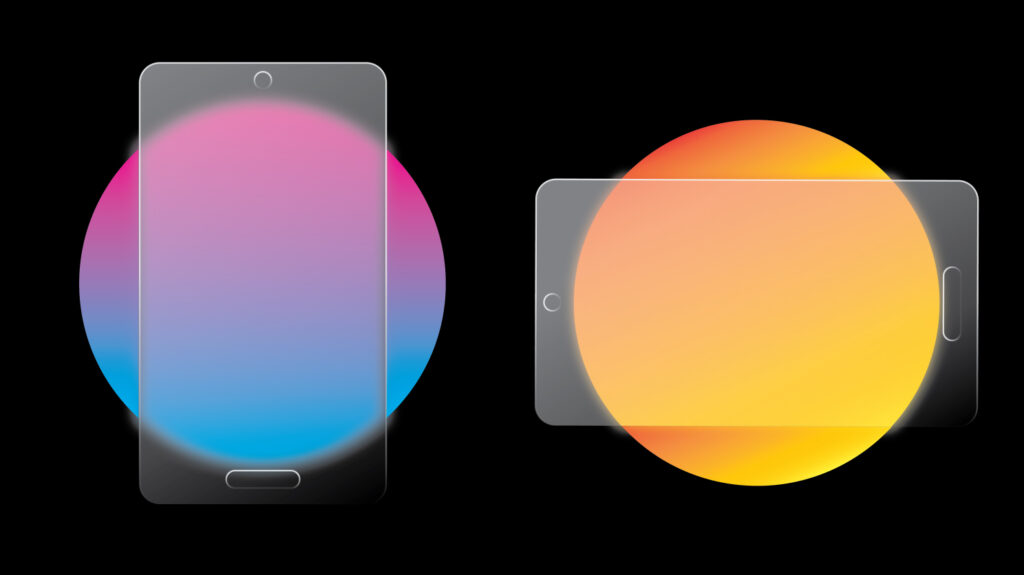
Glassmorphism
Finally, If you’re talking about 2021 trends, you can’t leave off glassmorphism. Glassmorhpism is a design trend that not everyone has heard of; an example of this design type being creatively used is in the retail industry to display cards and phones. Glassmorphism is a design aesthetic where background frames or buttons are made to look like glass by blurring elements behind them. It’s most popular in UI designs, but it can be overused and make everything look confusing.
Trends come and go, and it’s hard to say what will be trending from one year to the next, but these six trends have been some of the most noteable for 2021.